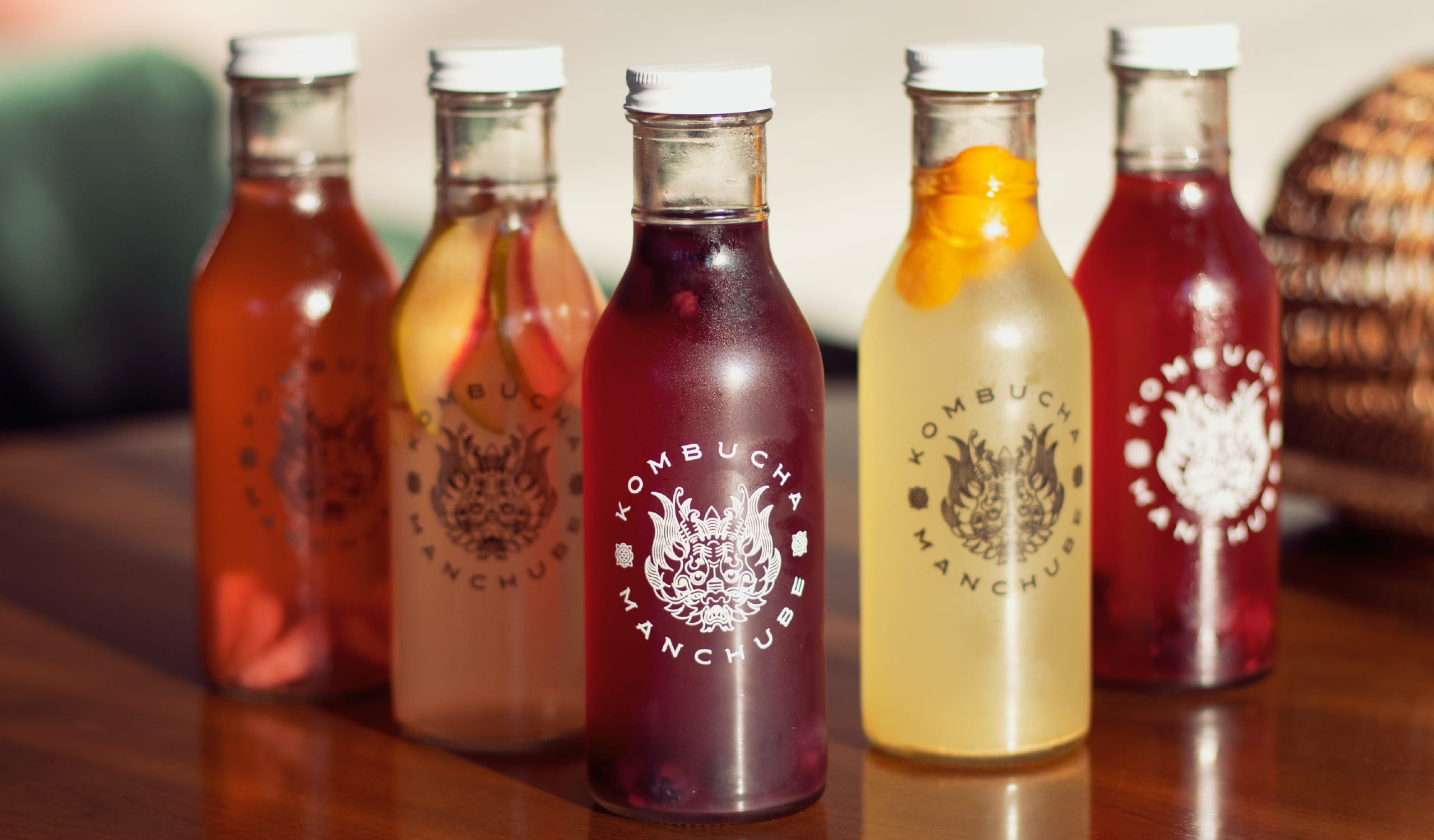
We built the brand by discovering a powerful essence that was transmitted through a
new verbal and graphic identity.
This had to achieve a balance between the tradition of the product and the active
search for the well-being of our modern audiences.
Kombucha Manchube
Naming / Branding / Art Direction
The kombucha is a product that today is positioned from a modern culture of well-being and health.
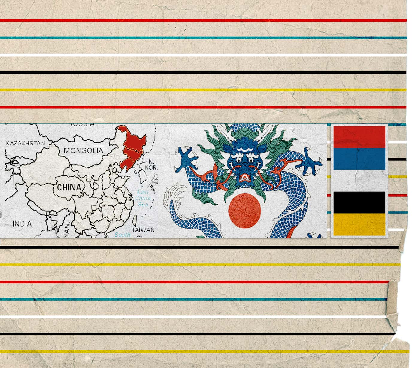
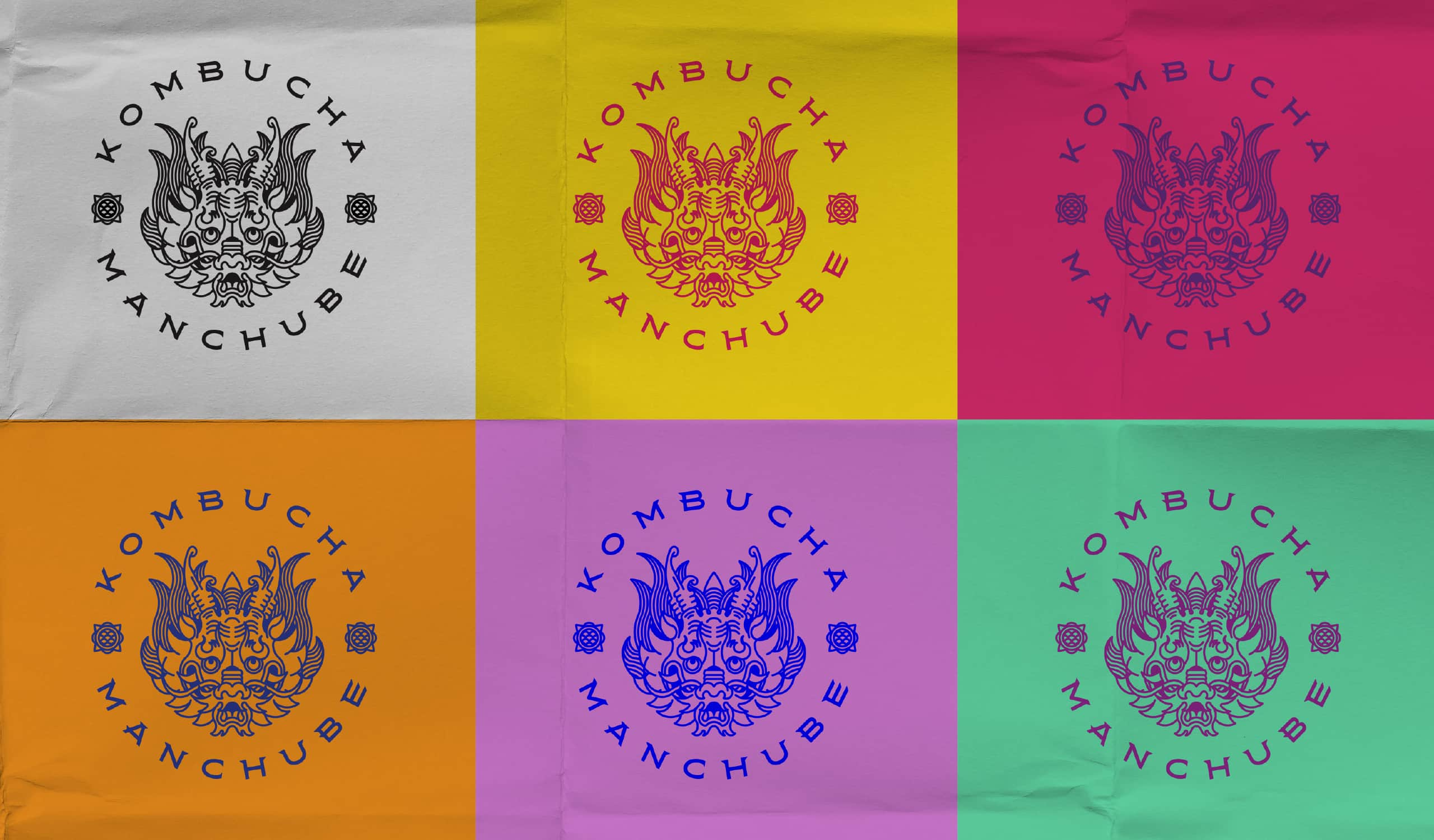
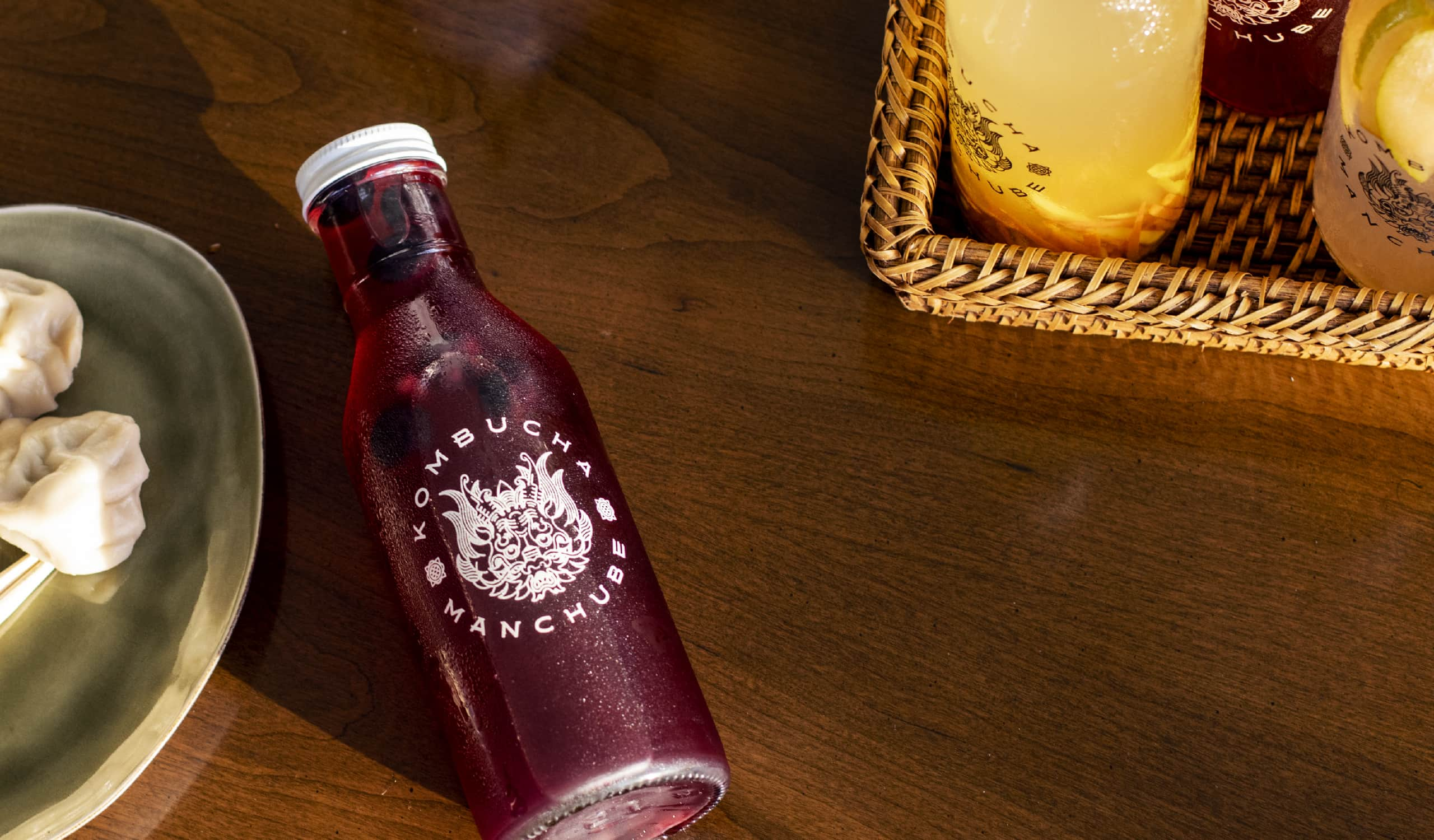
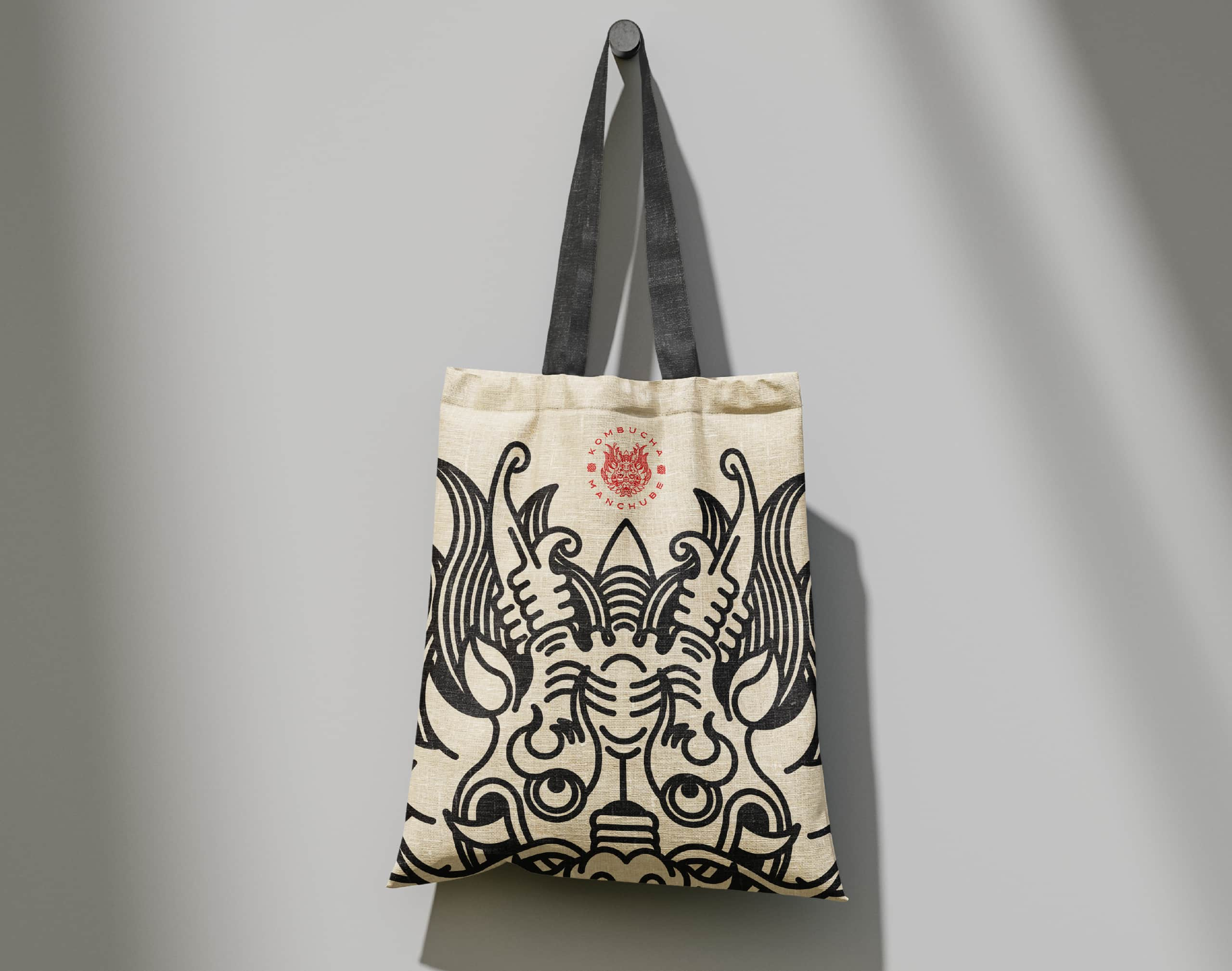
Looking for the construction of a proper name for the brand, we decided to build from its tradition and from the exploration of its past. We investigated the history of the drink and found the idea of the dragon, which transcended the oriental stereotype by exploring its historical justification in the Qing Dynasty, the last emperors of China and from the Manchuria region.
A land where the Manchurian Mushroom that gives rise to the drink began to be cultivated.
In the Qing traditions we discovered the dragon banner, the last flag of Imperial China, as well as a range of colors used in court uniforms that enriched our color palette.
The union of Kombucha with its traditional origin in Manchuria, allowed us to achieve a name with strength and tradition: MANCHUBE.

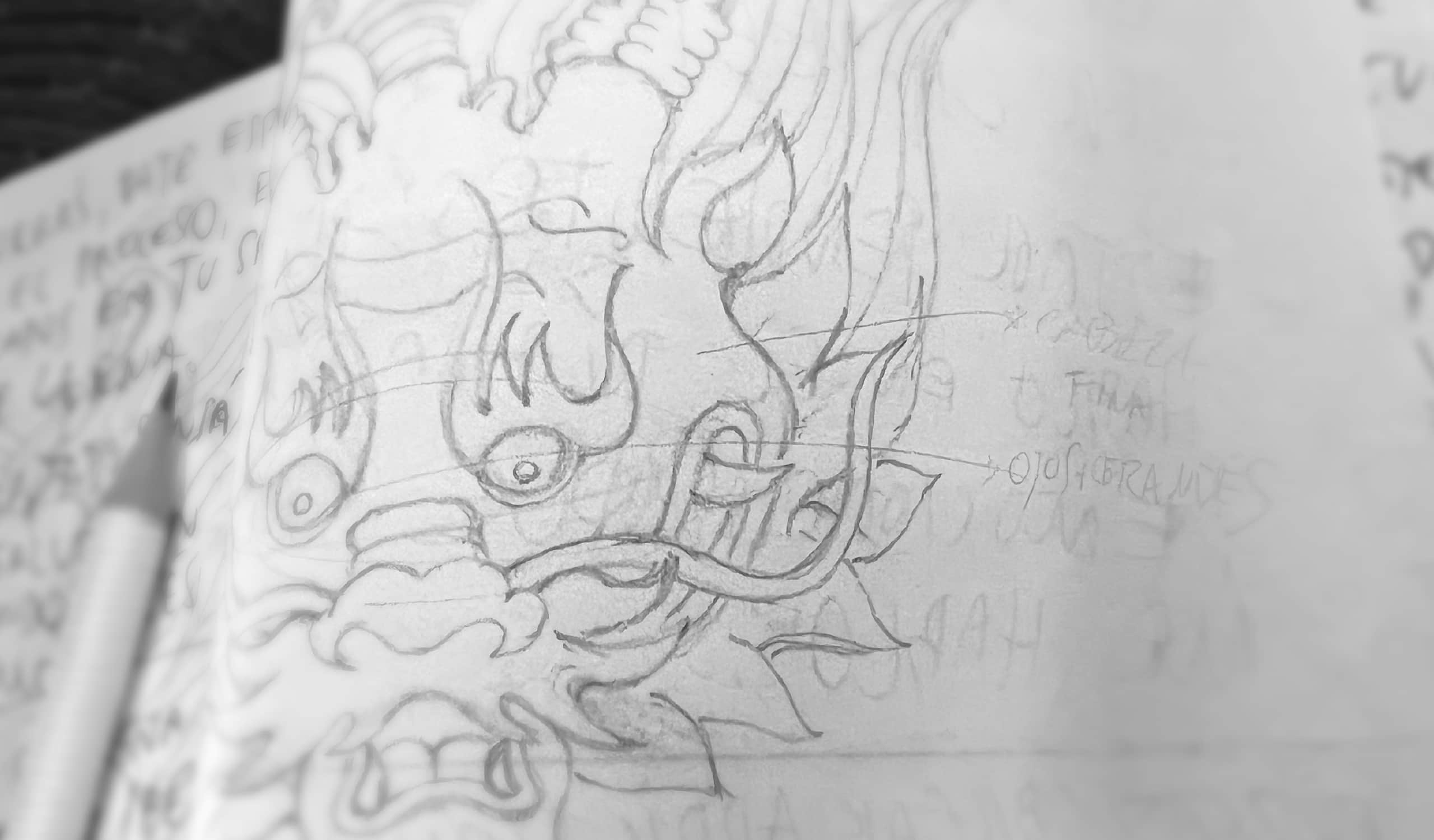
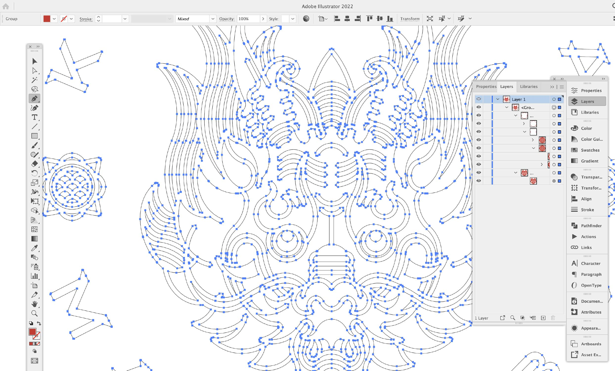
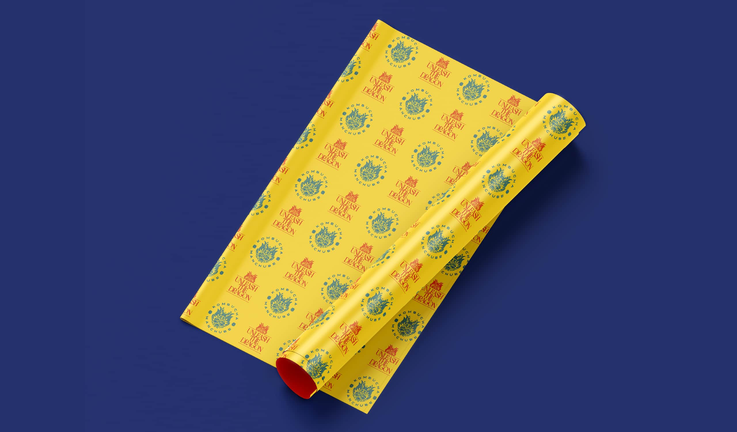


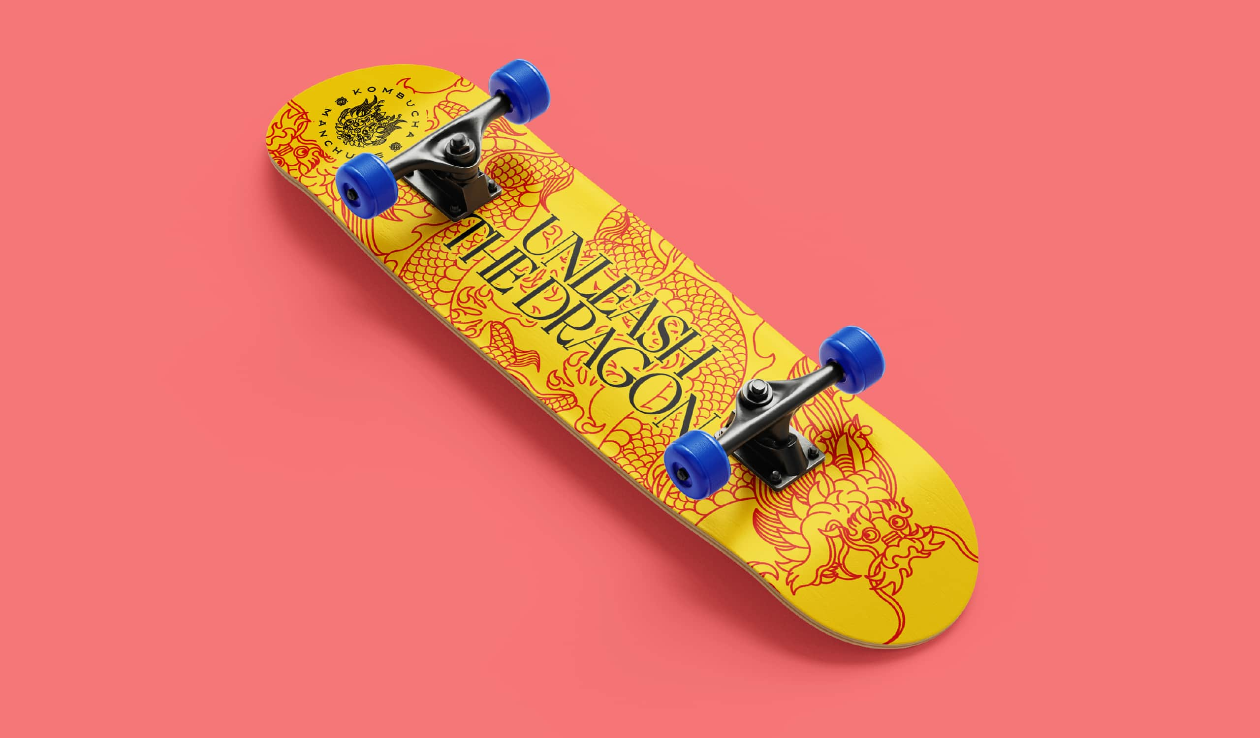
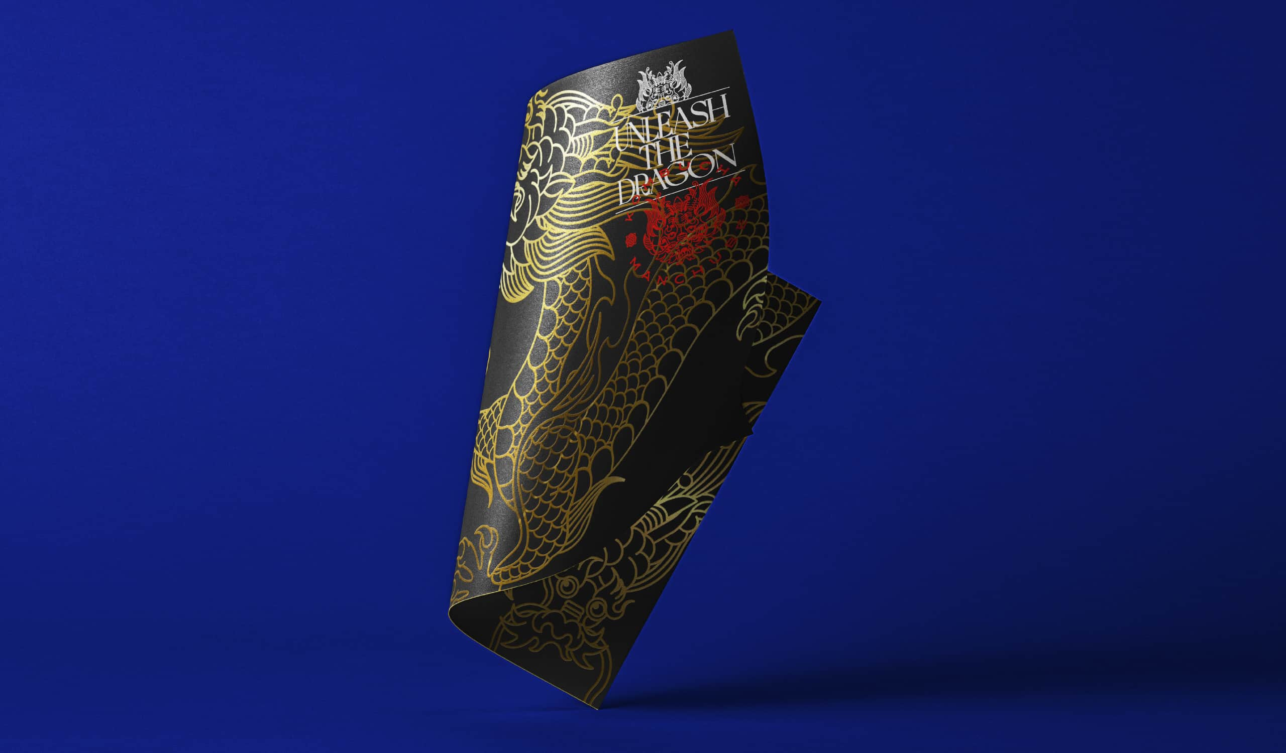
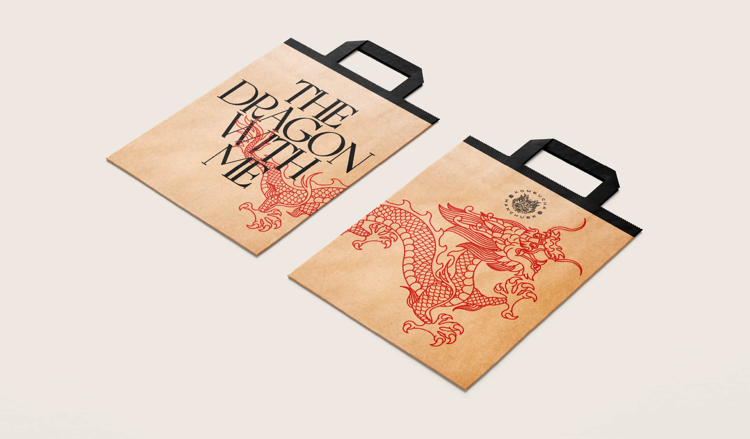


We felt like powerful and
healthy dragons,
at least for a while.
Brand Strategy / Photography: Lagé Studio
Art Direction / Illustration / Graphic Design : Alberto Barahona
Naming / Storytelling: Oscar Molina, Juan José Dobles
Motion graphics: Josué Camacho
